
Athlab Branding
Athlab Branding
Designed brand identity, packaging, and logo, blending founder vision with market research to craft a bold, user-focused supplement brand keeping a specific target audience in mind. Athlab aimed to become a premium affordable brand and the branding was done keeping that in mind.
Designed brand identity, packaging, and logo, blending founder vision with market research to craft a bold, user-focused supplement brand keeping a specific target audience in mind. Athlab aimed to become a premium affordable brand and the branding was done keeping that in mind.

Client
Athlab
Athlab
Athlab
CAtegory
Healthcare & Supplement
Healthcare & Supplement
Healthcare & Supplement
ARTIST
Megha Arora
Megha Arora
Megha Arora
Product Duration
4 Weeks
4 Weeks
4 Weeks
Brand Identity Reearch

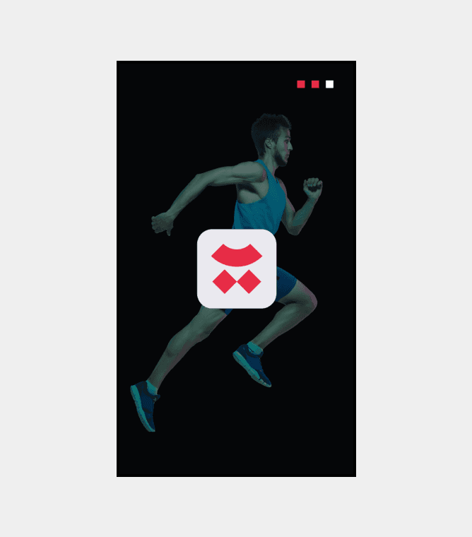
Explored athletic elements, sports symbols, and letter A variations for logo concepts.
Studied competitors colour choices and identified the importance of neon colors in sports branding.
Researched running athlete images and how symmetry can be achieved through it.
Explored athletic elements, sports symbols, and letter A variations for logo concepts.
Studied competitors colour choices and identified the importance of neon colors in sports branding.
Researched running athlete images and how symmetry can be achieved through it.
Explored athletic elements, sports symbols, and letter A variations for logo concepts.
Studied competitors colour choices and identified the importance of neon colors in sports branding.
Researched running athlete images and how symmetry can be achieved through it.
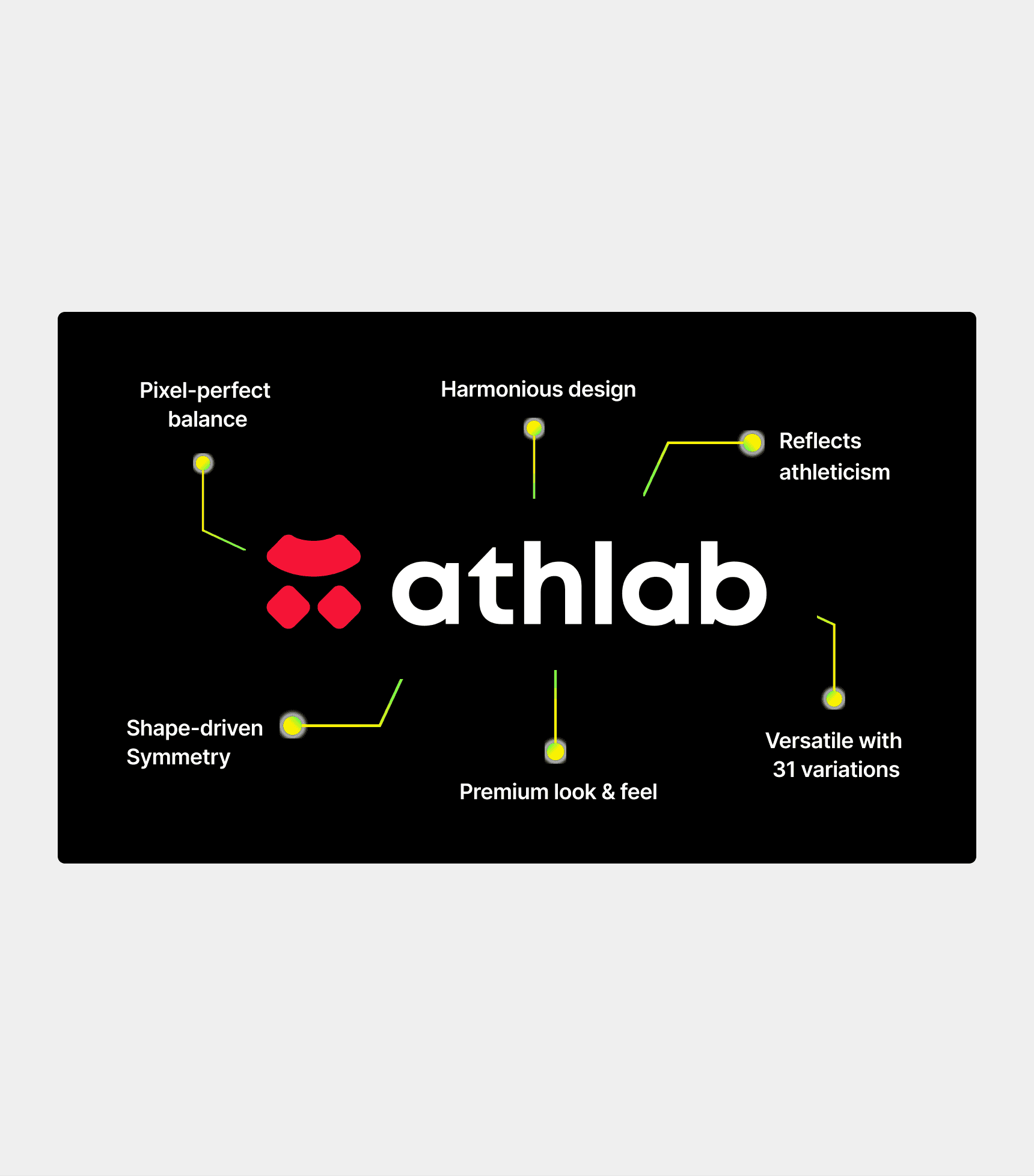
Logo Design Highlights
Developed multiple logo versions, incorporating symmetry and geometric shapes.
Iterated through concepts like a running athlete, sports elements, and the letter A.
Finalized a symmetric logo representing a running athlete using shapes for movement.
Developed multiple logo versions, incorporating symmetry and geometric shapes.
Iterated through concepts like a running athlete, sports elements, and the letter A.
Finalized a symmetric logo representing a running athlete using shapes for movement.
Developed multiple logo versions, incorporating symmetry and geometric shapes.
Iterated through concepts like a running athlete, sports elements, and the letter A.
Finalized a symmetric logo representing a running athlete using shapes for movement.
Design System
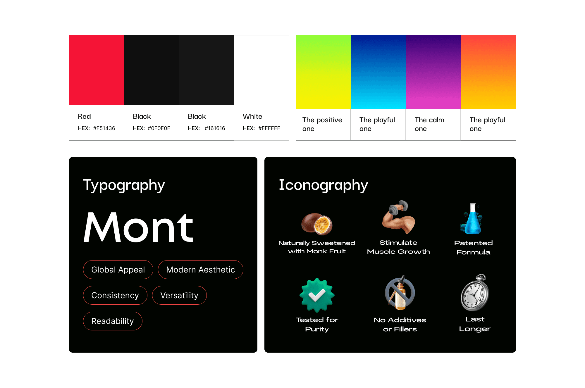
Brand Colour:
Vibrant Red - Represents energy, passion, and aligns with top supplement brands.
Neutrals:
Black, White, and Grey - Provide a clean and versatile backdrop for brand elements.
Typography:
Mont & Integral CF
Iconography:
3D icons for trendy and modern feel
Brand Colour:
Vibrant Red - Represents energy, passion, and aligns with top supplement brands.
Neutrals:
Black, White, and Grey - Provide a clean and versatile backdrop for brand elements.
Typography:
Mont & Integral CF
Iconography:
3D icons for trendy and modern feel
Brand Colour:
Vibrant Red - Represents energy, passion, and aligns with top supplement brands.
Neutrals:
Black, White, and Grey - Provide a clean and versatile backdrop for brand elements.
Typography:
Mont & Integral CF
Iconography:
3D icons for trendy and modern feel
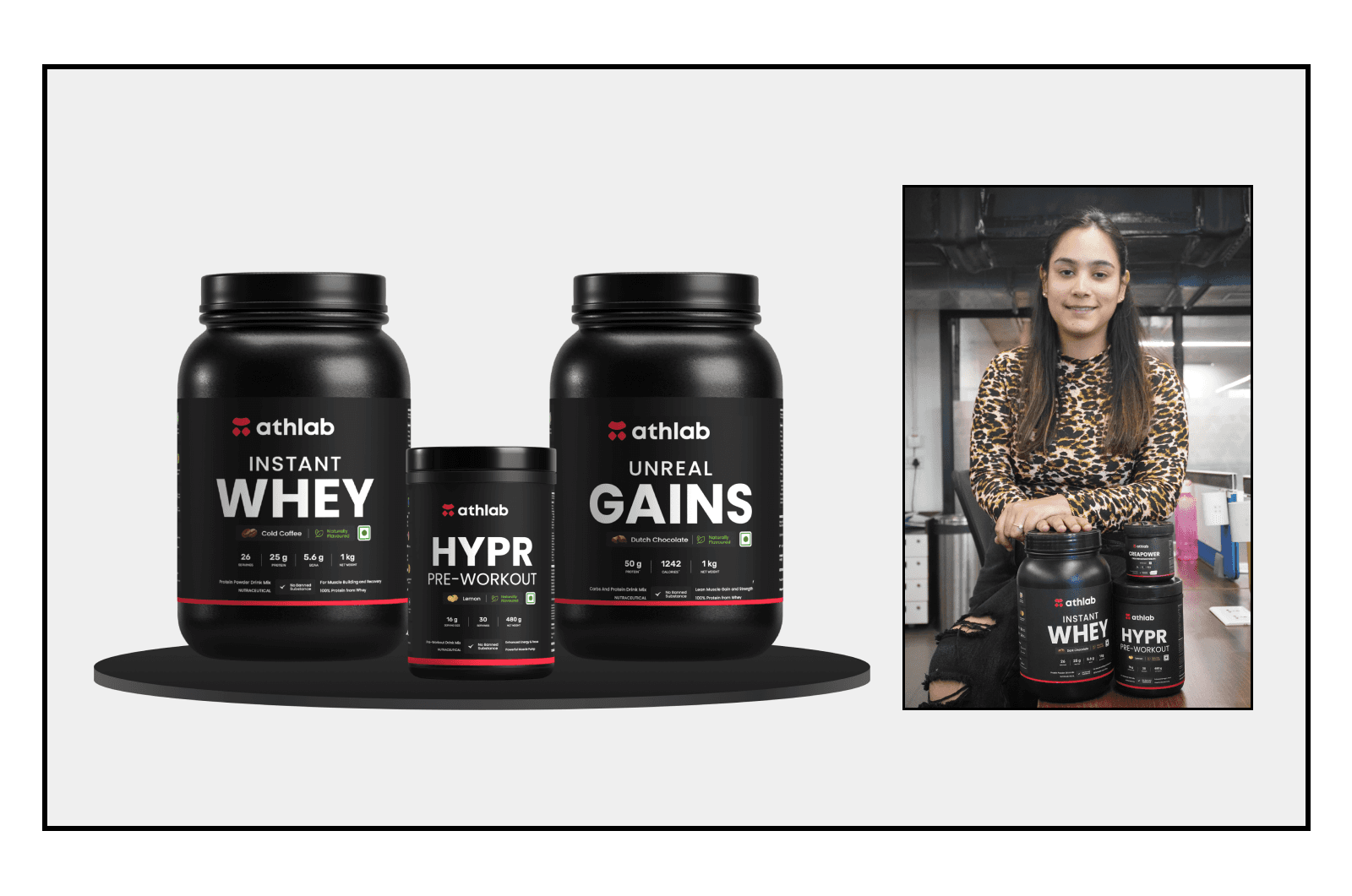
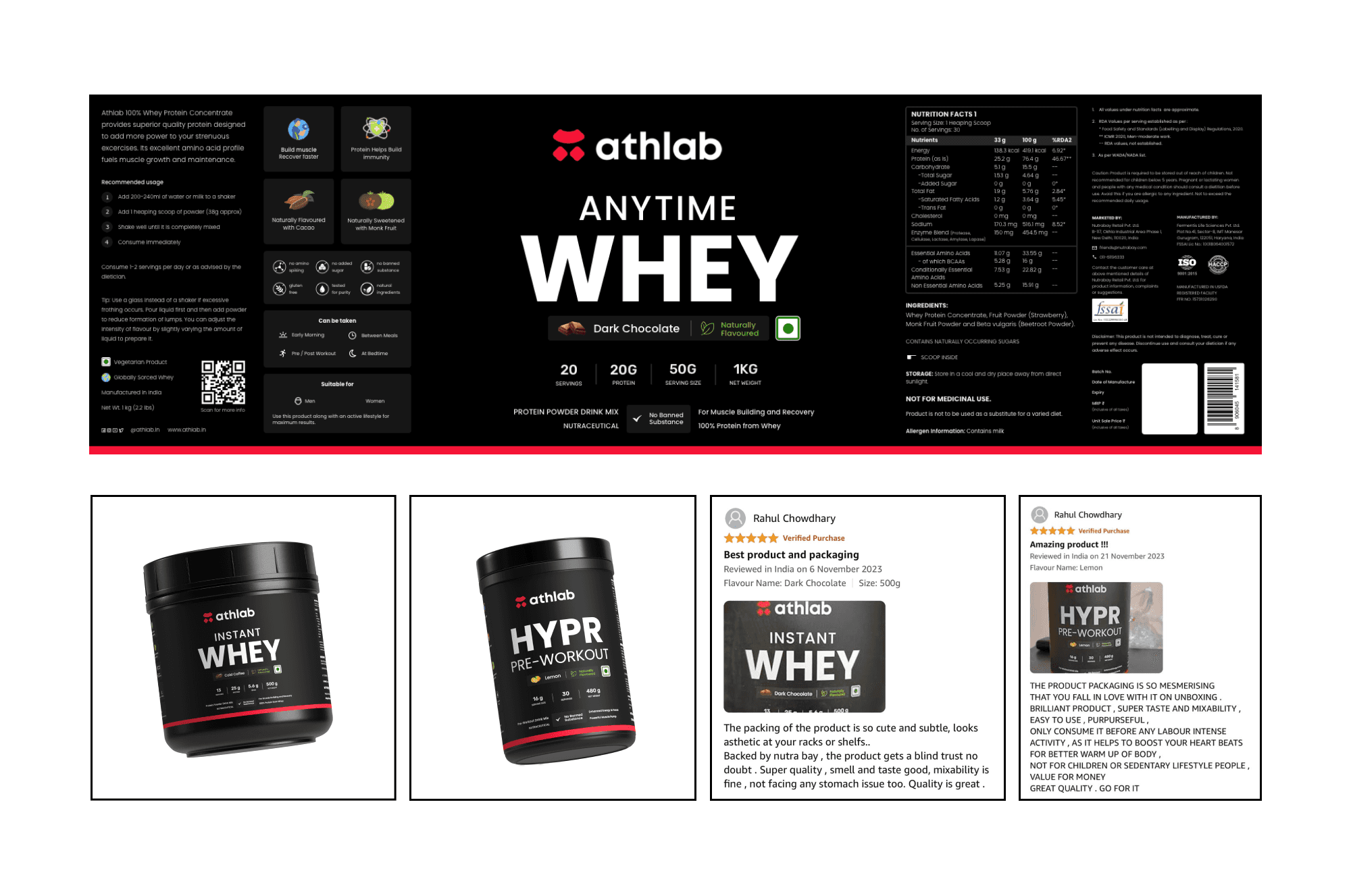
Label Design Highlights
Aligned label design with Nutrabay's style while adding a trendy and attractive vibe.
Utilized a black background with a red stripe for a premium look.
Structured the label with key product information, usage instructions, and nutritional facts.
Aligned label design with Nutrabay's style while adding a trendy and attractive vibe.
Utilized a black background with a red stripe for a premium look.
Structured the label with key product information, usage instructions, and nutritional facts.
Aligned label design with Nutrabay's style while adding a trendy and attractive vibe.
Utilized a black background with a red stripe for a premium look.
Structured the label with key product information, usage instructions, and nutritional facts.
Results
Positive customer reviews on Amazon.
Increased brand visibility and recognition resulting in successful market penetration.
Released in August and we have crossed 1000+ orders till date.
Positive customer reviews on Amazon.
Increased brand visibility and recognition resulting in successful market penetration.
Released in August and we have crossed 1000+ orders till date.
Positive customer reviews on Amazon.
Increased brand visibility and recognition resulting in successful market penetration.
Released in August and we have crossed 1000+ orders till date.


Frequently Asked Questions
Frequently Asked Question
Frequently
Asked
Questions
What makes 6thsensesites different from other web agencies?
What types of businesses do you work with?
What is a UI/UX audit, and why is it important?
What is your project process?
What is the difference between SEO and AEO?
Do you offer website/ app maintenance after launch?
What makes 6thsensesites different from other web agencies?
What types of businesses do you work with?
What is a UI/UX audit, and why is it important?
What is your project process?
What is the difference between SEO and AEO?
Do you offer website/ app maintenance after launch?
What makes 6thsensesites different from other web agencies?
What types of businesses do you work with?
What is a UI/UX audit, and why is it important?
What is your project process?
What is the difference between SEO and AEO?
Do you offer website/ app maintenance after launch?